
Week 9 - Week 13
Jordan Matthew Susanto (0352661) BDCM
Advanced Typography
Task 3: Type Exploration and Application
Instruction
Fig 1 Instruction
Task 3: Type Exploration and Application
For task 3 we have to choose the topic for our project. the topic are
Create a font that is intended to solve a larger problem or meant to be part of a solution in the area of your interest be it graphic design, animation, new media or entertainment design or any other related area not necessarily reflecting your specialisation. End result: a complete typeface generated (.ttf) + applications.
or
Explore the use of typeface in your area of interest, understand its existing relationship, identify areas that could be improved upon, explore possible solutions or combinations that may add value to the existing typeface. End result: a complete typeface generated (.ttf) + applications.
or
Experiment. For your idea to qualify as an experiment it must be novel and unique — working with material that might be 3- dimensional, digitally augmented, edible, unusual, typographic music video or fine art. End result: defined by student.
Research, Ideation, Sketches
Fig 2.1 Proposal
Mr. Vinod Instructed us to come out with 3 different ideas for the final task. I choose the first one as my project for final task.
Explanation of Chosen Idea

Fig 2.1 Skate and Destroy CD Cover PS1
Thrasher Presents: Skate and Destroy is a simulation like take on the skateboarding genre released on the PlayStation in 1999. It was developed by Z-Axis, Ltd. and published by Rockstar Games.
Later Skate and destroy become the brand itself. Because the typeface that im going to make is based by a video game I'm trying to make it more like have a feeling of a retro video game

Fig 2.2 Atari Font
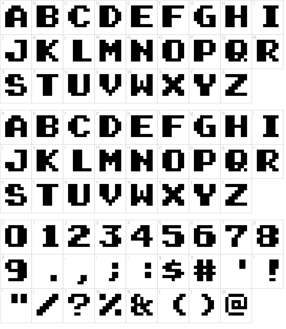
Fig 2.3 Mario Bros Font
After observing a arcade game font I notice that the old school game usually looks kinda blocky. It's because they made it with 8 bit. I think i'm going to make a font kinda blocky not 8 bit and i'm going to use the original skate and destroy typeface characteristic for this task.
Sketch

Fig 2.4 letter "H" and "O" Skecth
I wacth a netflix serier called Abstract: Art of Design the Jonathan Hoefler: Typeface Design episode. I learn that we can make letter "H" and letter "O" as the first letter that we make and from that we can expand to the another letter by using the shape of leeter "H" and "O".
Digitisation and Exploration


Fig 3.2 "O" and "H" After Digitization process
So after I digitize the letter "O" and "H" I use the shapes of those letter to create another letter. Mr. Vinod told me that it is better to create the normal font first just to make sure it look consistent and later I can decorate the font later after i did the normal one.

Fig 3.3 Uppercase Digitization Font not decorated

Fig 3.4 Uppercase Digitization Font structure
I finished my uppercase like Mr. Vinod said first I try to make it look consistent first and then i begin to start the decorated the font

Fig 3.5 Uppercase Decorated
After i finished the decorating process i show my work to Mr. inod on the feedback session on the class. Mr. Vinod told me that my "W" and "V" looks weird and he thinks i need to study how w and look alike. After that feedback session i make a new "W" and "V".

Fig 3.6 "V" and "W" after feedback session.
After i finished create a new "V" and new "W" i continue to create the lowercase, number, and punctuation.

Fig 3.7 Complete Typeface
After Completing the typeface i begin to generate the font in the font lab

Fig 3.8 Generating the typeface in the fontlab
Click HERE to download the font.
Application
Application #1: Skateboard Design Ads

Fig 4.1 Skateboard Design Ads
Application #2: CD Skate Video Cover

Fig 4.2 CD Skate Video Cover
Application #3: Sticker Ads

Fig 4.3 Sticker Ads

Fig 4.4 Cruiserboard design Ads
Application #5: Skate and Destroy skate video thumbnail

Fig 4.5 Video Thumbnail Design
PDF
Fig 4.6 PDF
Reflection
Experience
On this assignment i feel like it's quite interesting. Making a typeface is a new thing to me. Creating each letter is very fun to me because i have to use the same shapes and you can explore the possibilities of some of the shapes when making the letter. and i already use the fontlab before so it's not a new thing to me.
Observe
I realize that the consitency of each letter is really important when making a typeface. Inconsisten letter will make the typeface looks off.
Findings
I have a better understanding and point of view how the good typeface should look like.
Feedback
Week 12
Make something cool for the installation
Week 11
there are some letter that i decorated too much it’ll be better if i do the simple one
Week 10
there are some letter that inconsistent like the T and the w and x
Further Reading

Dig 5 Abstract: The Art of Design
I watch the typography episode of this series from netflix. I learn how the process of how make the proper typeface from this series.
Comments
Post a Comment