
Jordan Matthew Susanto (0352661) BDCM
Typography
Task 2: Typographic Exploration & Communication (Text Formatting & Expression)
Lectures
Lectures notes 1 to 6 already finished at task 1
Typography Task 2 Progress Demo
Fig 1.1 Typo Task 2 Process Demo Video Tutorial
Mr. Vinod gave us an demonstrate of what we have to do for this task 2.
Instruction
Fig 2 Instruction
So, we have to make a 2 page editorial page with a text provided text that Mr. Vinod gave us on facebook. We cannot use an image and color. Minor graphical elemenent such as lines, shades, etc are allowed. We have to use Adobe Indesign to compose the text and we allowed to use Adobe Illustrator for make an type expression.
Task 2: Text Formatting and Expression
1. Idea Exploration

Fig 3.1 Pixar opening
I chose the "Crack The Code" text that Mr. Vinod gave us on facebook. Somehow i got the idea by looking at the pixar opening and i start to make the type expression on Adobe Illustrator.
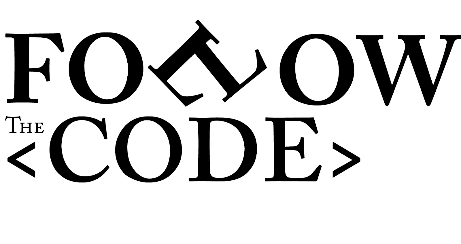
Fig 3.2 Type Expression that i created in Adobe Illustrator
Typeface: Adobe Caslon Pro (Bold)
I try to make a the double "L" like a walking leg and i add "< >" this symbol on the code word so it's express the code word more.
2. Layout Progress
I make a couple layout in Adobe Indesign. and here is the result.
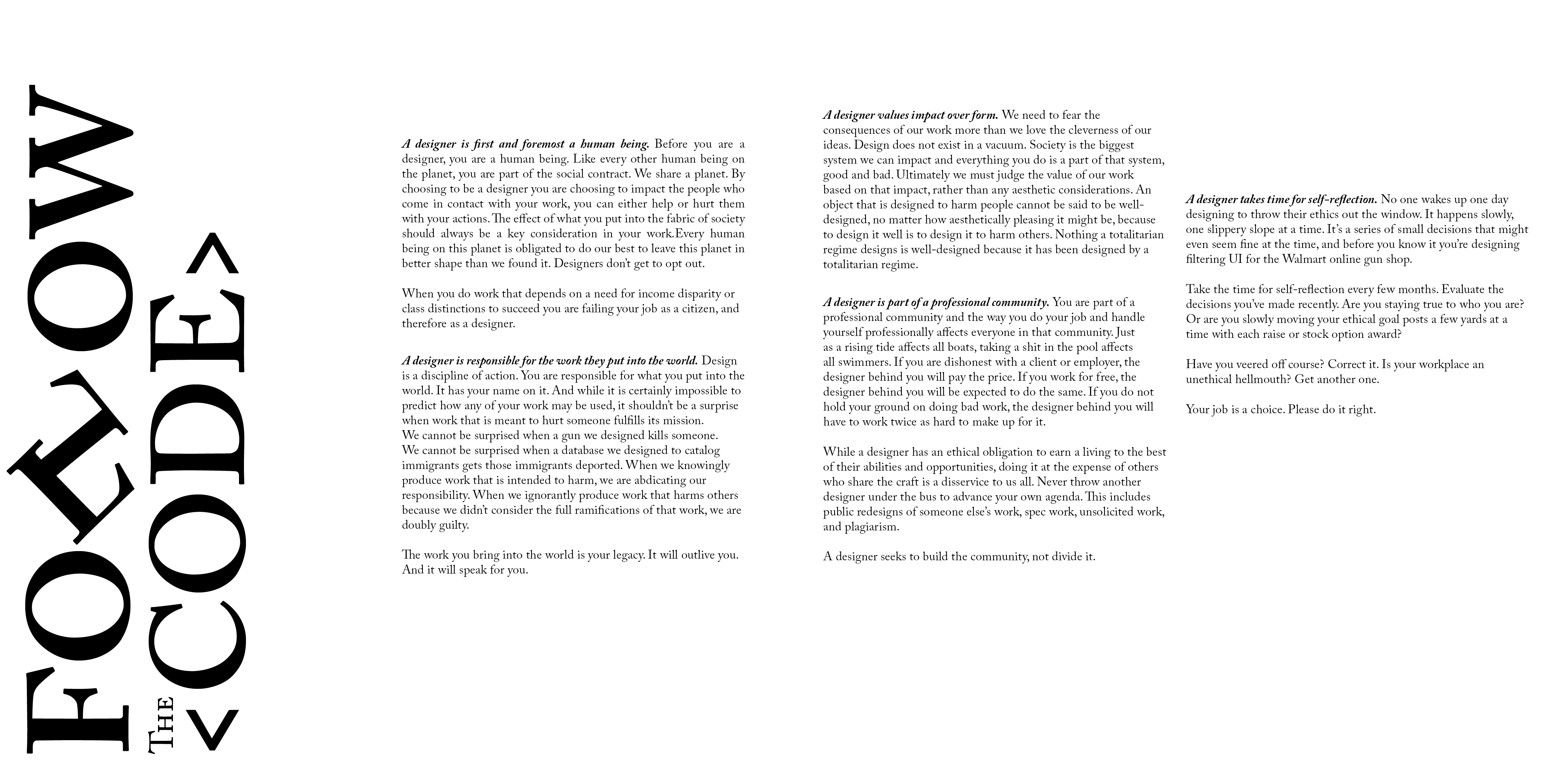
Fig 4.1 Layout 1

Fig 4.2 Layout 2
After Mr. Vinod gave me a feedback i realise that i forget to use grid guide on my text format. Because of that my layout seems like unfinished layout. Mr. Vinod gave me a couple advice for my Layout too so, i fix my layout.

Fig 4.3 Layout 1 after the feedback session

Fig 4.4 Layout 2 after feedback session
I tried to make the font size bigger to fix the weird too much white space on the layout before. And right now i use the grid guide so the text is felt more well formatted than before.
3. Shortlisted Layout

Fig 5.1 Layout #1
Font: Adobe Caslon Pro
Typeface : Adobe Caslon Pro (Bold)
Font size : 10pt
Leading: 11pt
Paragraph Spacing: 11pt
Average characters per line : 55 - 61
Alignment: Left
Margins : 10mm (top, left, right), 10mm (bottom)
Columns : 4
Gutter (for columns) : 5mm

Fig 5.2 Layout #2
Font: Adobe Caslon Pro
Typeface : Adobe Caslon Pro (Bold)
Font size : 10pt
Leading: 11pt
Paragraph Spacing: 11pt
Average characters per line : 55 - 61
Alignment: Left
Margins : 10mm (top, left, right), 10mm (bottom)
Columns : 4
Gutter (for columns) : 5mm
Final Task 2: Typographic Exploration and Communication

Fig 6.1 Final Task 2: Typographic Exploration and Communication - JPEG
Fig 6.2 Final Task 2: Typographic Exploration and Communication - PDF
Feedback
Week 6: Mr. Vinod like my Type expression and he said, i have a right idea about text formatting but, need a better execution.
Reflection
Experience
I really enjoy to do this task. From this assignments i know the rules and requirements to make a layout designs. I really enjoy making my layout design and i feel Mr. Vinod feedback help me to make my layout design look better
Observation
When making this design and watching a whole feedback that Mr. Vinod gave us in the class, i observed that structure and stability is very important when comes to designing a layout design. and the most important thing is the hierarchy of information must be placed in right way.
Findings
In this assignments i found out how to use the white space in the right way. White space is very important in layout designing. If the designer doesn't use the white space correctly the layout design will look like unfinished layout.
Further Reading

Fig 7.1 Principles for Good Layout Design
The Anatomy of Type is the ultimate stylistic guide to the intricacies and design of 100 indispensable typefaces. A delightful, colorful, and visual reference guide created by Stephen Coles and Tony Seddon--two acknowledged pros in the font design world--The Anatomy of Type was developed with typographers, graphic designers, and font geeks in mind, graphically and visually expanding on the current font-mania initiated by Simon Garfields's Just My Type.
Comments
Post a Comment