Jordan Matthew Susanto (0352661) BDCM
Typography
Task 3A: Type Design & Communicatin (Font Design)
Lectures
Instruction
Fig 1.1 Instruction
Task 3A: Type Design and Communication
Mr. Vinod told us to do some researches before we start this Task 3A. We need to understand about the anatomy of font such as baseline, ascender line, cap height, and median line.
Fig 2.1 Typography anatomy
To make the consistency on font "O" is very important. if it's not the letter like a. c. e. p, etc. will not have the consistencty in it.
Fig 2.2 "e" letter deconstruction
Fig 2.3 "a" letter deconstruction
Fig 2.4 "n" letter deconstruction
Fig 2.2, 2.3, 2.4 is my attempt to deconstruction a, e, n letter to help me more understanding the anatomy and construction of Serifa Std.
Fig 2.5 Sketch 1
fig 2.6 Sketch 2
Fig 2.5 and 2.6 is mt sketching attempt for this task. Mr. Vinod said he think the only sketches that might work is the first sketch on Fig 2.5. And after that i continue my process to digitization of my font.
fig 2.7 1st Attempt of Digitization
I make the digitization of my font sketches. At first in this process i feel that i've been struggling with makin a shape of my font and it makes this font not consistent. When in feedback session Mr. Vinod gave me a hint to fix my font design and i got a new idea to fix this design.
fig 2.8 "o" letter
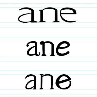
The first thing i make is the o letter. Just like what i said "o" letter helps you to make your font consistent. and then i create the rest
fig 2.9 Final Typeface design
Measurement:
Ascender: 657pt
Capital Height: 636pt
Median Line: 500pt
Baseline: 0pt
Descender: -168pt
After this process i continue to put our typeface design to fontlab
fig 2.10 Ascender, Descender, Line gap setting on fontlab
fig 2.11 Cap Height and x height settings on fontlab
fig 2.12 My Typeface Settings.
and then, i copy my typeface to the fontlab
Fig 2.13 Copying Into fontlab
Fig 2.14 Required letter.
And i started to kerning the required alphabet and word " make type great again"
Fig 2.15 Kering Process
After i export my font design from fontlab i start to designin my poster
Final Submission
Fig 3.1 Final Typeface "CasualType"
Link = " CasualType "
Fig 3.2 Final Poster Design
Fig 3.3 Final Poster Design - PDF
Feedback
Week 9
General Feedback: Need to explore more
Specific Feedback: Can go with sketch 1
Week 10
General Feedback: I seem to struggling when making the shapes
Specific Feedback: Make an "o" letter first. so the typeface can be more consistent. nice touch on "t" letter.
Reflection
Experience
Task 3 is pretty challanging for me but also interesting experience. i never designin a font before and this is my first time so, i learn a lot from this task. I learn about the measurement for font, how important is the "o" letter, etc.
Observation
I always observed a details when designin font. I'm looking at pinterest for a reference and make a proper typeface. And i really know how iportant is the measurement to make a typeface.
Findings
I know how to designin a typeface and how to use a fontlab.
Further Reading
Fig 4.1 Typeface Design & Font Making Process w/Mark Davis


Comments
Post a Comment